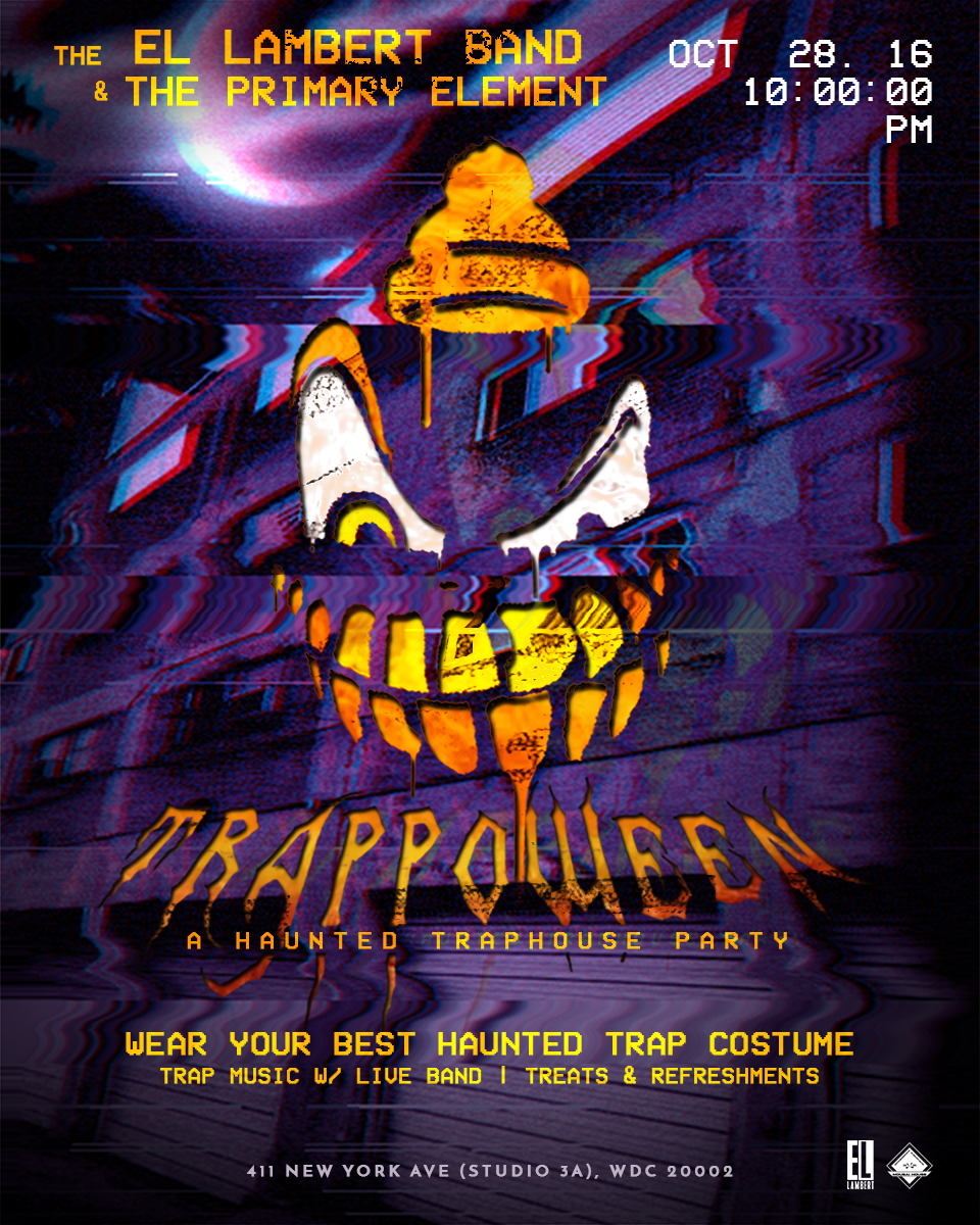
Project Brief
Mousai House was an underground artist organization that served the Washington, DC area. The goal was to redesign the previous logo and branding materials and create something simple that reflected the foundation of the organization. The founder began Mousai House in his living room giving free guitar and music lessons. With the new design materials I wanted to provide a design solution that was as effective as it was eye catching.
Services Rendered
Logotype
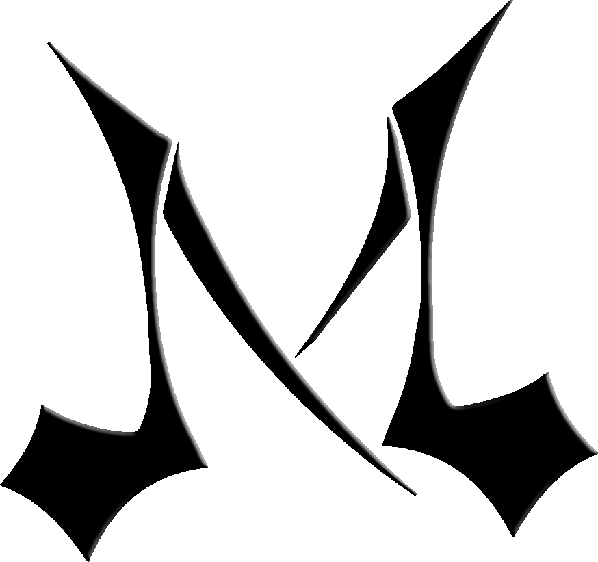
The original design was a a typographic piece of just the letter "M". With the new design, the goal was to provide a solution that was physically balanced, meaning to the Mouse House experience, and to have a modern look.
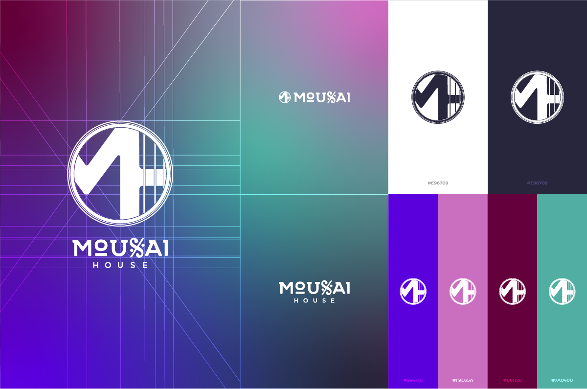
I thought it would be cool to incorporate guitar strings & the Segno musical symbol for directing the player to return to a spot earlier in a musical score that it's marked by, as reminder to artists the importance creating a foundation & self-reflection.
Branding Materials
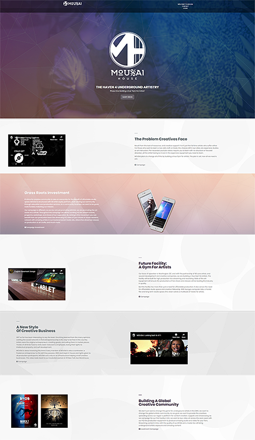
When devising the color scheme for the branding materials I was inspired by the lighting used in the incubator where a good majority of live performances took place. Then applied those colors to the website and and physical branding materials for fundraising campaigns and membership information.

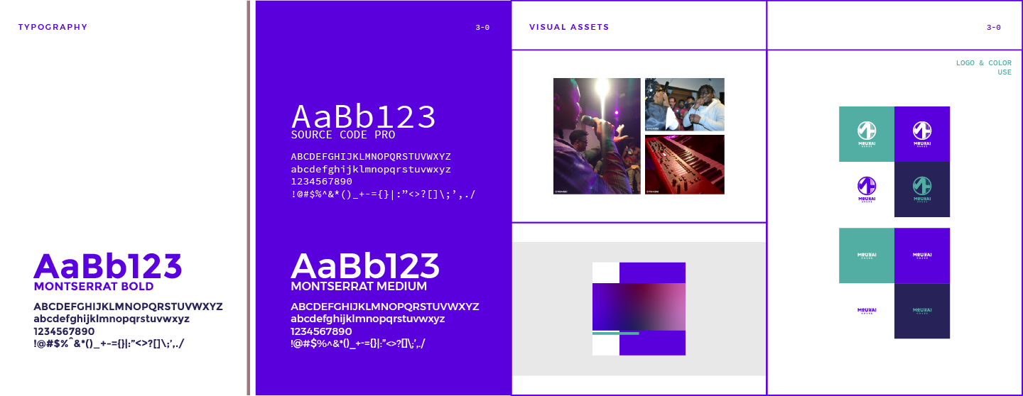

Flyers & Ads
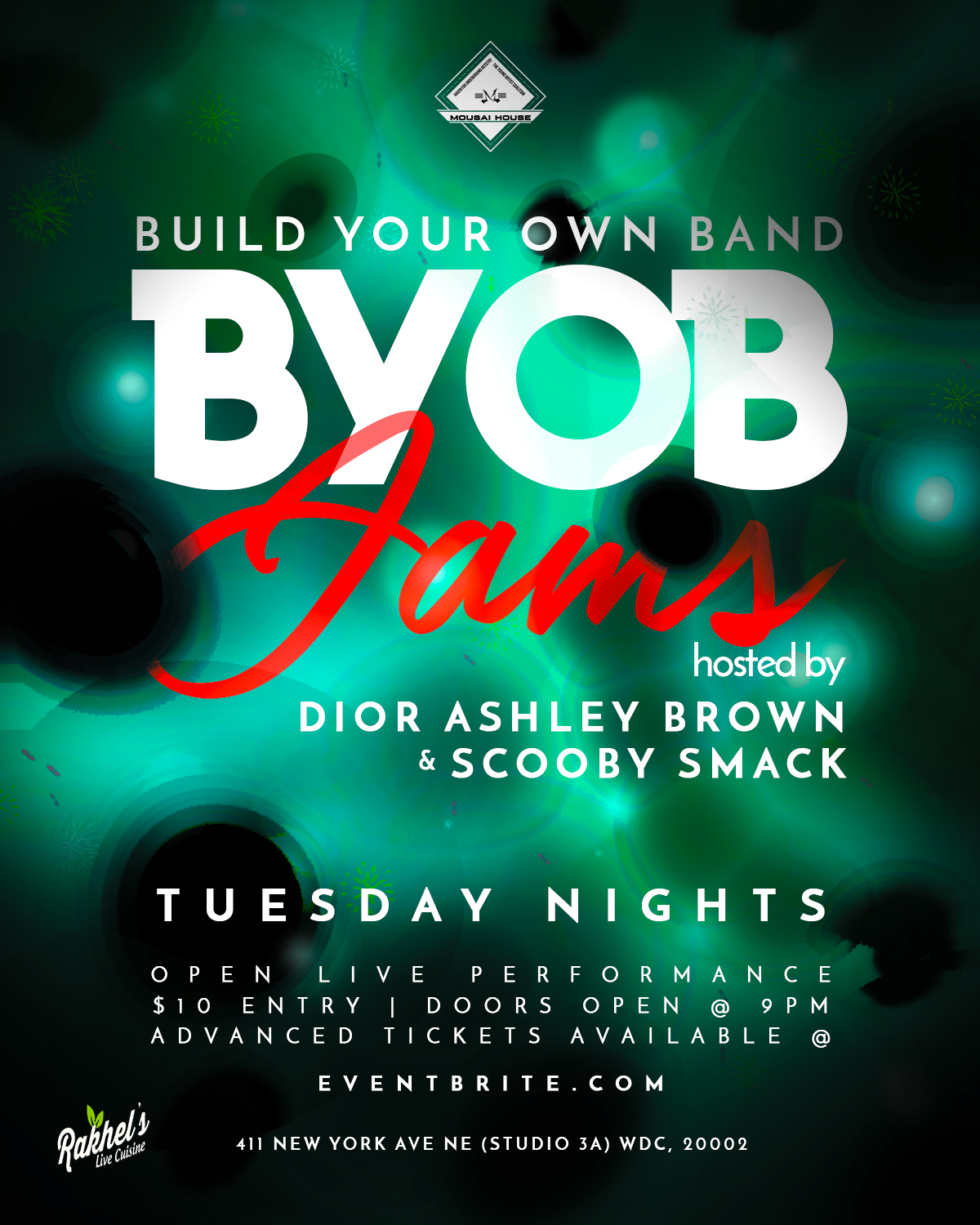
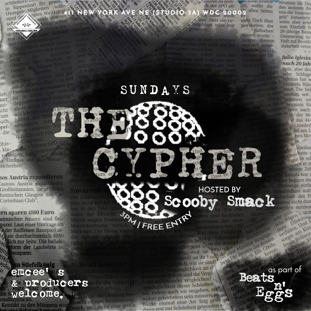
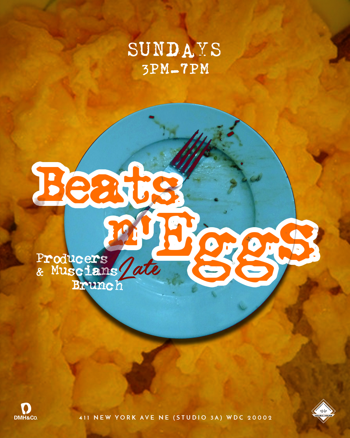
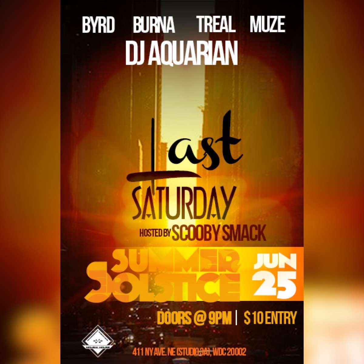
For each reoccurring event, a visual profile & logo was created to target its audience. this included but was not limited to:
